Introduction
Finding the perfect combination of colors can be daunting. Whether you’re designing a website, creating artwork, or decorating a room, it’s important to understand which three colors work best together. This article will provide a comprehensive guide to selecting the perfect trio of colors for any project.
Color combination is the use of two or more colors in a single design or piece of art. These colors can be used in a variety of ways to create different effects and evoke certain emotions. By understanding the principles of color theory and exploring current trends, it is possible to create a harmonious color palette that works well together.

Color Combinations for Interior Design
When it comes to interior design, color has a major impact on the overall atmosphere of a room. When selecting a color palette for a space, it is important to consider the desired mood and tone of the room. Different combinations of three colors can create vastly different atmospheres.
For example, a bright and cheerful room could be achieved by using a combination of yellow, pink, and green. In contrast, a more calming and relaxing atmosphere could be created with a combination of blue, grey, and white. By analyzing the impact of each color used in a room, it is possible to create the desired atmosphere.
Trending Colors: A Guide to Picking a Palette
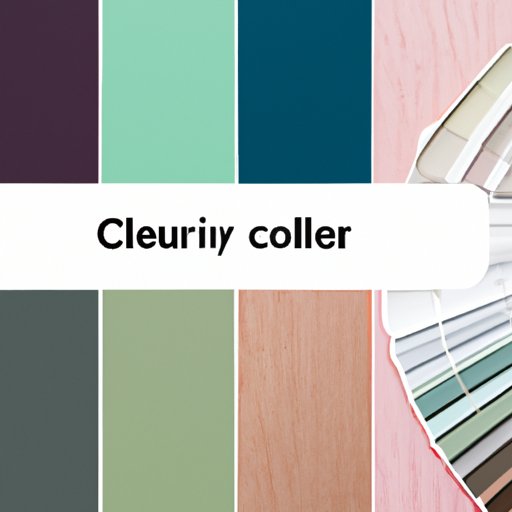
It’s also important to keep up with current color trends when selecting a palette. Trends are constantly changing, so it’s important to stay up to date with the latest color combinations. Popular choices include earthy tones such as olive green, terracotta, and mustard yellow; pastel shades like lavender, blush pink, and mint green; and vibrant hues such as cobalt blue, coral, and hot pink.
By exploring current color trends, it is possible to select a combination of three colors that work well together. The key is to choose colors that complement each other and create a harmonious and balanced palette.

Harmonious Hues: How to Create a Color Scheme
Creating a harmonious color scheme requires an understanding of basic color theory. Colors can be divided into three main categories: primary, secondary, and tertiary. Primary colors (red, blue, and yellow) cannot be made from any other hue. Secondary colors (orange, green, and purple) are created by combining two primary colors. Tertiary colors (yellow-green, red-violet, etc.) are created by mixing a primary and a secondary color.
By combining one primary, one secondary, and one tertiary color, it is possible to achieve a balanced palette. For instance, a combination of blue (primary), orange (secondary), and yellow-green (tertiary) would work well together. This would result in a vibrant and eye-catching palette.
Decorating with the Color Wheel
The color wheel is a useful tool when it comes to selecting color combinations. It is made up of 12 colors, divided into three categories: warm, cool, and neutral. Warm colors (red, orange, and yellow) evoke feelings of energy and excitement. Cool colors (blue, green, and purple) tend to be calming and soothing. Neutral colors (white, black, and grey) are versatile and can be used to create a muted and subtle effect.
By using the color wheel, it is possible to choose complementary colors for a three-color scheme. Complementary colors are opposite each other on the wheel and create a striking contrast when used together. For example, a combination of blue, yellow, and red would create a vibrant and eye-catching palette.
Color Psychology: Create an Impactful Color Palette
Color psychology is the study of how different hues evoke certain emotions in people. Each color has its own unique connotations and can be used to create a particular mood or atmosphere. For example, yellow is often associated with happiness and optimism, while blue is often associated with calmness and tranquility.
By understanding the psychological effects of color, it is possible to create an effective three-color combination. By selecting colors that evoke the desired emotion, it is possible to create an impactful and memorable palette.

Finding Your Perfect Color Combination
When it comes to finding your perfect color combination, there are a few tips to keep in mind. First, consider the purpose of the project—is it for a website, a logo, a painting, or something else? The colors you choose should reflect the purpose of the project. Second, take the time to experiment with different color combinations. Try out a variety of different hues and see what works best.
Finally, look for inspiration in everyday objects. Nature is full of beautiful color combinations, so use this as a source of inspiration. Once you have found a few combinations that you like, it’s time to start experimenting and creating your own unique color palette.
Conclusion
Selecting the perfect combination of three colors can be a challenge. However, by understanding the principles of color theory, exploring current color trends, using the color wheel, and considering color psychology, it is possible to create a harmonious and balanced palette that works well together. With a little bit of experimentation, you can find the perfect color combination for any project.
(Note: Is this article not meeting your expectations? Do you have knowledge or insights to share? Unlock new opportunities and expand your reach by joining our authors team. Click Registration to join us and share your expertise with our readers.)