Introduction
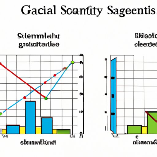
Graphing is a visual representation of data that can be used to quickly convey information and insights. In science, graphing is an essential tool for understanding data and conducting experiments, as it allows researchers to present and analyze large amounts of information in an easy-to-understand format. By plotting data points on a graph, scientists can identify patterns and relationships between variables, compare different groups of data, and draw conclusions about their research.
Step-by-Step Guide to Graphing in Science
Graphing in science requires careful planning and consideration. Here’s a step-by-step guide to creating effective and informative graphs.
1. Gathering Data
The first step in graphing is to collect data relevant to the experiment or study. Scientists must determine what type of data they need and then design experiments to collect it. Once the data has been collected, it should be organized and checked for accuracy before being plotted on a graph.
2. Choosing a Graph Type
After collecting the data, scientists must decide which type of graph best represents the data. The most common types of graphs used in science are line graphs, bar graphs, and scatter plots. Other types of graphs such as pie charts, histograms, and box plots may also be used depending on the type of data being analyzed.
3. Plotting the Data
Once the type of graph has been chosen, the data can be plotted. This involves assigning each data point to a specific point on the graph and connecting the points with lines or bars. It is important to make sure the data is plotted accurately so that the graph conveys the correct information.
4. Labeling and Interpreting the Graph
Finally, the graph must be labeled with titles, labels, and axes. This ensures that the graph can be easily understood and interpreted. Once the graph is labeled, scientists can interpret the data and draw conclusions based on the patterns and relationships between the variables.

The Basics of Graphing Scientific Data
In order to create accurate and informative graphs, scientists must understand the different types of graphs and when to use each one. Here’s a quick overview of the most commonly used graphs in science.
Understanding the Different Types of Graphs
Line graphs are used to show changes over time, such as the growth of a population or the development of a new technology. Bar graphs are used to compare different categories of data, such as the average temperature in different cities. Scatter plots are used to show the relationship between two variables, such as the amount of rainfall and the number of insects in an area. Pie charts are used to show the proportions of different categories, such as the percentage of people who prefer different types of music. Histograms are used to show the distribution of data, such as the heights of all the students in a class. Box plots are used to compare groups of data, such as the test scores of two different classes.
Knowing When to Use Each Graph Type
When deciding which type of graph to use, scientists must consider the type of data they have, the message they want to convey, and the audience they are trying to reach. For example, if scientists are presenting data to a general audience, they may choose to use a bar graph instead of a more complex graph such as a scatter plot. On the other hand, if scientists are presenting data to a group of experts, they may opt for a more complex graph that can provide more detailed information.
Tips for Creating Accurate and Informative Graphs
Creating accurate and informative graphs takes practice and experience. Here are some tips to help scientists create effective graphs.
Use Appropriate Scales
When creating a graph, it is important to select an appropriate scale for the x- and y-axes. If the scale is too small, the graph may not be readable. Conversely, if the scale is too large, the graph may be difficult to interpret. It is best to choose a scale that is neither too small nor too large and that is appropriate for the data being plotted.
Select the Correct Graph Type
It is important to choose the right type of graph for the data being presented. For example, if scientists are looking to compare different categories of data, they should use a bar graph. If they are looking to show the relationship between two variables, they should use a scatter plot. Selecting the wrong type of graph can lead to confusion and misinterpretation of the data.
Label All Axes Clearly
When labeling the axes of a graph, it is important to include all the necessary information. This includes the title of the graph, the units of measurement, and any other relevant information. Labeling the axes clearly helps ensure that the graph is easy to understand and interpret.
Consider Color Coding or Symbols
Using color coding or symbols can help make graphs more visually appealing and easier to interpret. For example, if scientists are comparing two different groups of data, they may choose to use different colors or symbols to represent each group. This makes it easier to distinguish between the two groups and can help viewers quickly understand the data.

Exploring Different Methods of Representing and Analyzing Data with Graphs
Graphs are a useful tool for representing and analyzing data, but they are not the only way to do so. Here are some additional methods for exploring data.
Using Statistical Tests to Analyze Data
Statistical tests such as t-tests and ANOVAs are used to determine whether there is a statistically significant difference between two or more groups of data. These tests can be used to compare the means of two or more groups and to determine whether the differences between the groups are due to chance or to a real effect.
Examining Relationships Between Variables
Correlation and regression analyses can be used to examine the relationship between two or more variables. These analyses can help scientists identify patterns and trends in their data and draw conclusions about the relationships between the variables.
Comparing Groups of Data
Comparisons between groups of data can be made using descriptive statistics such as mean, median, and mode. These statistical measures can help scientists identify differences between groups of data and draw conclusions about their experiments.
Conclusion
Graphing is an essential tool for analyzing and interpreting data in science. By understanding the basics of graphing and following the steps outlined in this guide, scientists can create accurate and informative graphs that help them draw meaningful conclusions about their research. Additionally, by exploring different methods of representing and analyzing data, scientists can gain deeper insights into their experiments.
(Note: Is this article not meeting your expectations? Do you have knowledge or insights to share? Unlock new opportunities and expand your reach by joining our authors team. Click Registration to join us and share your expertise with our readers.)
