Introduction
A line of best fit is a straight line that is used to represent the relationship between two sets of data points. It is used in statistical analysis to determine the correlation between two variables, and to predict values based on the relationship. In this article, we will explore how to create a line of best fit in Excel, using a step-by-step guide.
Step-by-Step Guide to Creating a Line of Best Fit in Excel
Creating a line of best fit in Excel is relatively straightforward, and can be done in just a few steps. Here is a step-by-step guide to creating a line of best fit in Excel:
1. Setting up the Data in Excel
The first step is to set up the data in Excel. This involves entering the data points into two columns, one for each variable. Make sure that each data point is entered in its own cell. Once the data has been entered, it is ready to be plotted.
2. Creating a Scatter Plot with the Data
Once the data has been entered, the next step is to create a scatter plot with the data. To do this, select the data points and go to the ‘Insert’ tab. Select ‘Scatter’ from the ‘Charts’ section and choose the type of chart you want to create. The scatter plot should now appear on the worksheet.
3. Adding the Trendline Function
Once the scatter plot has been created, the next step is to add the trendline function. To do this, select the data points and then click on the ‘Layout’ tab. Select ‘Trendline’ from the ‘Analysis’ section and choose the type of trendline you want to use. The trendline should now appear on the chart.

Using the Trendline Function to Create a Line of Best Fit in Excel
Once the trendline has been added to the chart, the next step is to use the trendline function to create a line of best fit. There are several types of trendlines available in Excel, including linear, polynomial, exponential, logarithmic, and power. Each type of trendline has its own unique properties and characteristics, so it is important to choose the right one for your data.
1. Understanding the Different Types of Trendlines
Linear trendlines are the most common type of trendline, and are used when the data points form a straight line. Polynomial trendlines are used when the data points form a curved line. Exponential trendlines are used when the data points form an exponential curve. Logarithmic trendlines are used when the data points form a logarithmic curve. Power trendlines are used when the data points form a power curve.
2. Choosing the Right Type of Trendline for Your Data
Choosing the right type of trendline for your data is important, as it will affect the accuracy of the line of best fit. If the data points form a straight line, then a linear trendline should be used. If the data points form a curved line, then a polynomial trendline should be used. If the data points form an exponential curve, then an exponential trendline should be used. If the data points form a logarithmic curve, then a logarithmic trendline should be used. If the data points form a power curve, then a power trendline should be used.
The Basics of Plotting a Line of Best Fit in Excel
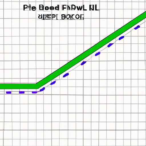
Once the type of trendline has been chosen, the next step is to understand the basics of plotting a line of best fit in Excel. The line of best fit is defined by two parameters: the slope and the intercept. The slope is the rate at which the data points change over time, and the intercept is the point at which the line of best fit crosses the y-axis.
1. Understanding the Slope and Intercept of the Line
The slope of the line is the rate at which the data points change over time. It is calculated by taking the difference between two data points and dividing it by the difference in their x-values (time). The intercept is the point at which the line of best fit crosses the y-axis. It is calculated by taking the value of the y-intercept of the line and subtracting the slope multiplied by the x-value of the point.
2. Calculating the Slope and Intercept
The slope and intercept of the line of best fit can be calculated using Excel formulas. To calculate the slope, use the SLOPE formula, which takes two cells of data and calculates the slope of the line connecting them. To calculate the intercept, use the INTERCEPT formula, which takes the slope and the x- and y-values of a data point and calculates the point at which the line of best fit crosses the y-axis.

How to Calculate and Graph a Line of Best Fit with Excel
Once the slope and intercept have been calculated, the next step is to calculate and graph the line of best fit with Excel. To do this, use the LINEST formula, which takes the slope and intercept and calculates the equation of the line of best fit. Once the equation has been calculated, it can be graphed using the scatter plot created earlier. The line of best fit should now be visible on the chart.

Visualizing Data with a Line of Best Fit in Excel
Once the line of best fit has been graphed, the next step is to visualize the data with a line of best fit in Excel. This can be done by adding error bars to the graph. Error bars are lines drawn at either end of the line of best fit that indicate the range of values that the data points could fall within.
1. Understanding Error Bars
Error bars are lines drawn at either end of the line of best fit that indicate the range of values that the data points could fall within. They are used to show the uncertainty of the data points, and can be used to identify outliers or areas where the data does not fit the line of best fit.
2. Adding Error Bars to the Graph
Once the error bars have been understood, they can be added to the graph. To do this, select the data points and then click on the ‘Layout’ tab. Select ‘Error Bars’ from the ‘Analysis’ section and choose the type of error bars you want to use. The error bars should now appear on the chart.
Conclusion
Creating a line of best fit in Excel is relatively straightforward, and can be done in just a few steps. By following the steps outlined in this article, you can easily create a line of best fit in Excel. The benefits of visualizing data with a line of best fit include being able to identify relationships between variables, identify outliers, and make predictions based on the data.
(Note: Is this article not meeting your expectations? Do you have knowledge or insights to share? Unlock new opportunities and expand your reach by joining our authors team. Click Registration to join us and share your expertise with our readers.)
