
Introduction
Color is a powerful tool for communicating meaning in design. It has the ability to evoke emotions, create visual interest, and shape the perception of a brand. But how does color work, exactly? This article explores the science and psychology of color in design, to help you create an effective color palette for your brand.
Exploring the Science of Color
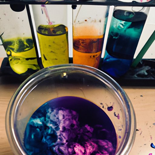
At its core, color is simply light reflected off of objects. The light that is absorbed by the object is what gives it its color. The colors we see are the result of the combination of all the different wavelengths of light that make up white light. When a particular wavelength is reflected off of an object, this becomes the color we perceive.
The manipulation of color is based on a few scientific principles. Color temperature is one such principle. It refers to the warmth or coolness of a color. Warmer colors, like reds and oranges, have a higher temperature than cooler colors, like blues and greens. Hue, saturation, and value are also important concepts when working with color. Hue refers to the purest form of a color, while saturation is the intensity of the hue, and value is the lightness or darkness of the hue.
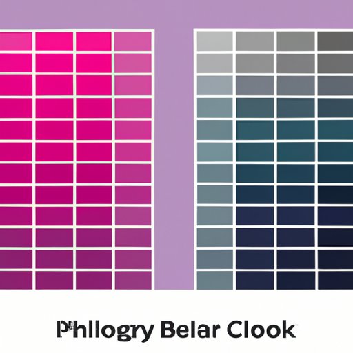
Understanding color theory is essential for creating effective color combinations. Different colors can produce different effects, depending on their relationship to each other. Color harmonies are used to achieve balance and harmony in design. These include complementary colors, analogous colors, split complementary colors, triadic colors, and tetradic colors. Each of these harmonies will be discussed in more detail later in this article.
The Psychological Impact of Color in Design
Color has a powerful psychological impact on people. Different colors can evoke different emotions and reactions. For example, warm colors, like red and orange, can evoke feelings of energy and excitement. Cool colors, like blue and green, can evoke feelings of calm and relaxation. Color can also be used to create visual interest, as certain colors naturally attract the eye.
When selecting a color palette for a project, it’s important to consider the context and the meaning of the colors you’re using. Certain colors may have a cultural or historical significance that should be taken into account. For example, in some cultures, red may be seen as a sign of good luck, while in others it may be seen as a sign of danger. By understanding the meaning of colors, you can ensure that your color palette is sending the right message.
Color Palette Selection for Branding
Choosing a color palette for branding is a crucial step in the design process. A well-crafted color palette can help to differentiate your brand and give it a unique identity. When selecting a color palette for your brand, there are a few things to consider.
First, consider the purpose of the brand. Are you trying to convey a sense of energy and excitement? Or are you trying to create a feeling of peace and tranquility? Once you’ve identified the desired emotion, you can begin to select colors that will best communicate that emotion. You should also consider the target audience for the brand. Different colors can evoke different reactions from different audiences, so it’s important to take this into account when selecting a color palette.
It’s also important to consider the overall aesthetic of the brand. Do you want the brand to look modern and sleek? Or do you want it to look more traditional and classic? Your color palette should reflect the overall aesthetic of the brand. Finally, consider the color harmonies mentioned earlier in this article. Different color combinations can create different effects, and it’s important to choose a combination that will best support your brand.
Conclusion
In conclusion, color is a powerful tool for communicating meaning in design. By understanding the science and psychology of color, you can create an effective color palette for your brand. When selecting a color palette, consider the desired emotion, the target audience, the overall aesthetic, and the color harmonies. With a little bit of knowledge and creativity, you can create a color palette that will help to differentiate your brand and give it a unique identity.
(Note: Is this article not meeting your expectations? Do you have knowledge or insights to share? Unlock new opportunities and expand your reach by joining our authors team. Click Registration to join us and share your expertise with our readers.)