
Introduction
Color harmonies are an integral part of art. Whether it’s a painting, a sculpture, or a digital artwork, the use of color can make or break an artwork’s success. By understanding the principles of color theory and how to combine colors in order to create beautiful color harmonies, artists can take their work to the next level.
But what is color harmony? According to the Merriam-Webster dictionary, color harmony is defined as “the combination of colors that produces a pleasing effect.” In other words, it is the way in which colors are used together to create a visually appealing composition.
In this article, we will explore how artists use color harmonies, from exploring the different types of color harmonies to analyzing famous paintings and understanding the psychology of color. We will also provide a guide to understanding color harmony in art, as well as tips for combining colors to achieve color harmony. Finally, we will investigate how digital artists use color harmonies.
Exploring the Different Color Harmonies Used by Artists
When it comes to creating color harmonies, there are several different types of color combinations that artists can use. Each has its own unique characteristics and qualities, and all of them can be used to create stunning effects in artwork.
Analogous Colors
Analogous colors are those that are adjacent to each other on the color wheel. They are usually three colors, such as blue, blue-green, and green, or red, orange, and yellow. This type of color harmony creates a very harmonious and peaceful feeling, as the colors blend together seamlessly.
Complementary Colors
Complementary colors are opposite each other on the color wheel, such as blue and orange or red and green. This type of color harmony creates high contrast, which can be used to create drama and excitement in an artwork. However, it can also be used to create balance and unity if used in moderation.
Triadic Colors
Triadic colors are three colors that are evenly spaced around the color wheel, such as yellow, blue, and red. This type of color harmony creates a vibrant, energetic feeling, and can be used to create a sense of movement and excitement in an artwork.
Split-Complementary Colors
Split-complementary colors are three colors, with one being the main color and the other two being the colors that are adjacent to the complementary color of the main color. For example, if the main color is blue, then the split-complementary colors would be green and orange. This type of color harmony creates a more subtle contrast than complementary colors, but still provides enough contrast to create interest in an artwork.
Monochromatic Colors
Monochromatic colors are shades of the same color, such as light blue, medium blue, and dark blue. This type of color harmony creates a soothing and peaceful feeling, as the colors blend together without any harsh contrast. Monochromatic colors can be used to create a calming and tranquil atmosphere in an artwork.

The Psychology of Color Harmonies and How it Affects Art
Color is a powerful tool that can be used to evoke certain emotions and reactions in viewers. Different colors can represent different meanings, and these meanings can be used to convey certain messages or ideas in artwork.
Color Symbolism
Different colors can symbolize different things. Red can symbolize passion and anger, while blue can symbolize serenity and tranquility. Green can symbolize growth and nature, while yellow can symbolize joy and optimism. Artists can use colors to represent certain symbols or themes in their artwork.
Color Emotion
Colors can also be used to evoke certain emotions in viewers. Warm colors such as red, orange, and yellow can create feelings of warmth and energy, while cool colors such as blue, purple, and green can create feelings of calmness and relaxation. By using colors strategically, artists can create artworks that evoke specific emotions in viewers.
Cultural Significance
Different cultures have different associations with certain colors. In some cultures, white may symbolize purity and innocence, while in others it may symbolize death and mourning. It’s important to consider cultural significance when choosing colors for artwork, as it can help create a more meaningful and powerful piece.
Analyzing Famous Paintings to Uncover Their Color Harmonies
By analyzing famous paintings, we can gain insight into how artists use color harmonies. Let’s take a look at some examples from both the Renaissance period and the modern art movement.
Examples from the Renaissance Period
Renaissance painters often used analogous colors in their works, such as in Leonardo da Vinci’s “Mona Lisa.” Da Vinci used a range of warm colors, including yellows, oranges, and reds, to create a harmonious and peaceful composition. Similarly, Michelangelo’s “The Creation of Adam” uses analogous colors to create a balanced and unified composition.
Examples from the Modern Art Movement
Modern artists often used bold and contrasting colors to create dynamic and powerful artwork. Pablo Picasso’s “Guernica” uses complementary colors, such as black and white, to create a stark contrast. Jackson Pollock’s “Number 1” uses triadic colors to create a vibrant and energetic composition. Both works demonstrate how powerful and effective color harmonies can be.
A Guide to Understanding Color Harmony in Art
In order to create color harmonies, it’s important to understand the principles of color theory. Here are some key concepts to keep in mind:
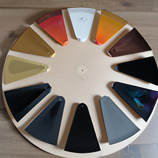
Principles of Color Theory
The color wheel is the foundation of color theory, and it is divided into primary, secondary, and tertiary colors. Primary colors (red, blue, and yellow) cannot be made from other colors, while secondary colors (orange, green, and purple) are created by combining two primary colors. Tertiary colors (yellow-orange, red-orange, red-purple, blue-purple, blue-green, and yellow-green) are created by combining a primary color with a secondary color.
Color Schemes
Color schemes are combinations of colors that create a particular effect. Some of the most popular color schemes are analogous, complementary, triadic, and monochromatic.
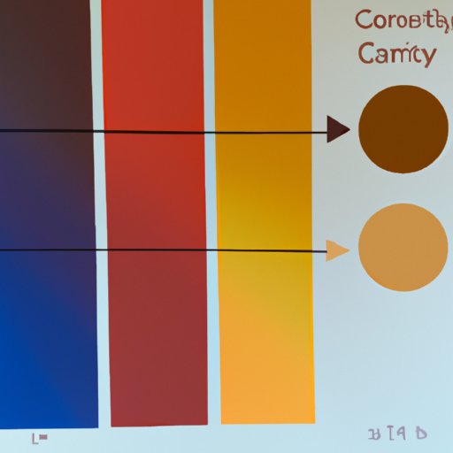
Color Temperature
Color temperature refers to how warm or cool a color appears. Warm colors (red, orange, and yellow) appear to be closer to the viewer, while cool colors (blue, purple, and green) appear to be further away. This concept can be used to create depth and perspective in an artwork.
Using Color Theory to Create Color Harmonious Paintings
Once you understand the principles of color theory, you can start applying them to your artwork. Here are some tips for creating color harmonious paintings:
Choosing a Color Scheme
First, decide which color scheme you want to use. Do you want to create a harmonious and peaceful composition with analogous colors? Or do you want to create a dynamic and exciting composition with complementary colors? Once you’ve chosen a color scheme, you can start selecting colors for your painting.
Applying Color Theory to Your Painting
Once you’ve selected the colors for your painting, you can start applying color theory to create a harmonious composition. Consider the color temperature of each color and how they interact with each other. Try using warm colors to bring objects closer to the viewer and cool colors to push objects away.
Tips for Combining Colors to Achieve Color Harmonies
Now that you understand the principles of color theory, here are some tips for combining colors to achieve color harmony:
Experimentation
Don’t be afraid to experiment with different color combinations. Try out different color schemes and see which ones work best for your artwork. You might be surprised by the results!
Working With Contrast
Contrast is an important element in a color harmony. If you want to create a dynamic and exciting composition, try using complementary colors to create high contrast. If you want to create a more subtle and harmonious composition, try using analogous or split-complementary colors.
Keeping It Balanced
It’s important to keep the composition balanced. Don’t use too much of one color, or your artwork will look unbalanced. Instead, try to use a variety of colors to create a balanced and harmonious composition.
Investigating How Digital Artists Use Color Harmonies
Digital art is a growing field, and digital artists have many tools at their disposal when it comes to creating color harmonies. Here are some tips for digital artists who want to create color harmonious artwork:
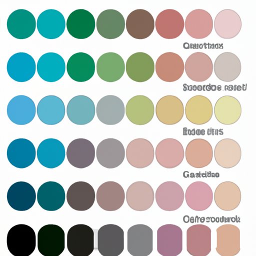
Utilizing Color Palettes
Most digital art programs have pre-made color palettes that can be used to quickly create harmonious color combinations. Experiment with different palettes and find one that works best for your artwork.
Working With Layers
Layers are a great way to create depth and texture in a digital artwork. By creating multiple layers and adjusting the color and opacity of each layer, you can create a harmonious composition with a variety of colors.
Incorporating Gradients
Gradients are a great way to add color and texture to a digital artwork. You can create gradients with different colors to create a harmonious composition. Experiment with different gradient angles and opacities to find the perfect combination.
Conclusion
Color harmonies are an essential part of art, and understanding how to use them can help take your artwork to the next level. By exploring the different color harmonies used by artists, understanding the psychology of color, analyzing famous paintings, and understanding the principles of color theory, you can create stunning and harmonious artwork. Additionally, digital artists can utilize color palettes, layers, and gradients to create color harmonious artwork.
(Note: Is this article not meeting your expectations? Do you have knowledge or insights to share? Unlock new opportunities and expand your reach by joining our authors team. Click Registration to join us and share your expertise with our readers.)